Wednesday, November 2, 2016

Updates!


Wednesday, November 2nd

     It has certainly been a while, hasn't it? I have been busy with art (as you may have guessed) & I plan on applying to some schools prominent in the fine arts land. I hope you're still interested in seeing some of my work(:


"J.F.K."  (12 x 9 in)

Reference photo
 https://en.wikipedia.org/wiki
/John_F._Kennedy
This acrylic piece was done as a gift for a very close friend. He pretty much worships J.F.K. and would not stop nagging me to make this for him...
In total, it took me around 6 hours to complete using a small detail brush for the whole face and my fingers for the background and blazer. The hardest part of it was his right eye as I had to re-do it at least 4 times until I was satisfied! I chose this photo because of its solemnity and pensive mood.


"Things do not happen, things are made to happen." 
  -John Fitzgerald Kennedy


Reference photo
"November 2nd" (7 x 8 in)

My grandparents recently came to visit and they brought my parents' wedding album to reminisce. Today is my mom and dad's wedding anniversary so I made them a small graphite drawing (right) for them from one of their cute wedding photos.
My dad is hard-core cheesing.

Friday, July 29, 2016

Beach Art

Friday, July 29th

     My grandma's friend recently opened a little shop on the beach. She is selling beach-themed artwork from local artists there this summer and Grandma asked my sisters and me to contribute. I originally thought, yeah that would be cool...I wish I had enough time to make something for it. So I kind of put it off and convinced myself I was too busy. However, we will be going for a visit soon and I was reminded of the opportunity. I used this week to crank out a few pieces and put to use the stack of (8x10in) canvases I have lying around.

     The reference picture for this one was taken on Cozumel Island while on a cruise with my friend. I thought the car and surfboards were awesome and turned it into a painting.


     This was made from a photo my mom took one night a few years ago on Georgian Bay. It's really a magnificent sunset and the colors give the artist freedom to use open, flowing brushstrokes. As a result, this painting took me around 25 minutes.


 This was also done from a reference photo taken in Cozumel. (right)


My dad bought some driftwood from a garage sale and I did a bit of woodburning on it. (left)


Tuesday, July 19, 2016

Summer so far

Tuesday, July 19th

     Summer thus far has been a great set of free time for me to create. Painting pairs of canvas shoes have been my main priority so people are able to put them to use and show them off as they do some summer traveling (: 

I received so many more orders than expected and I still haven't finished them all...I promise more to come!


original photo
pen and ink
     I bought some acrylic ink a while back and did not use it much. However, the rare occasion of me deciding to clean my room led to its rediscovery and me deciding to recreate a photo I took of myself at the Lincoln Memorial. The calligraphy pen and purple ink were great except for the fact that I spilled half the ink bottle on my white desk.
¯\_(ツ)_/¯ I definitely cleaned it all up right away in case you were wondering...


     My next piece was more of a meditative/reflective exercise involving not-so-exact strokes and finger painting. The basis was to create a piece using cooler colors and to incorporate nature. The effect this one has and the meaning behind it proved it to be a calming, no rush piece. 


In life, you will meet people from all different backgrounds and all different places. Each one is unique and has an effect on your life, no matter how small it may seem. The beauty comes when you come into contact with someone you immediately have a connection with and understand that they will be someone you won't soon forget. Sadly, certain factors create barriers and you may grow apart (figuratively and literally because it's a tree lol), but in the end they will always be rooted and linked somehow to each other. This is the meaning I had in mind while painting this, but as always it can be interpreted many different ways. 

I hope you can see the faces in the tree!
Rooted (18 x 24 in)


Wednesday, June 29, 2016

Oil Waterfall, Graphite Love

Wednesday, June 29th

     One of my close friends recently traveled to Hawaii and took a beautiful picture of a small waterfall in Maui. I instantly fell in love with the deep blues and greens naturally found in the Aloha State and wanted to recreate their beauty using oil paints. 
    
      Oil painting is a rather long process as you have to paint in layers. You start off just blocking in the lights and darks with a burnt umber or sienna brown thinned with Turpenoid. After that, you continue thinning the colors with Turpenoid (a healthier alternative to Turpentine) and you build onto your painting moving from back to front. Once you start getting to add the detail, you use Alkyd Glazing medium with the paint to produce a shiny finish. 
     This painting is one of my favorites and makes me want to live in Hawaii. (:

Maui Cove (16 x 20 in)

     Another of my friends asked me to create a graphite drawing of her and her boyfriend. This one is 18 x 24 in and it's a great shot of them!
K & T graphite


Wednesday, June 1, 2016

Coming to a Close

Wednesday, June 1st

     20-Time has made a significant impact on my life thus far. It has taught me that I can, in fact, bring my ideas to life. The endless support and praise I have received from family, friends, and strangers has been invaluable and really propelled me to create. Knowing that what you make is beautiful to someone else brings not only the viewer joy, but the artist as well.
   
     At the start of 20-Time I had 5 specific goals that I met to a certain extent.

  1.  came up with unique ideas for artwork
  2. drew a graphite rendition of my cousin for my aunt (see below "Maeve")
  3. created pottery (however, didn't sell it at school)
  4. used medium I haven't worked with a ton (metal spoons, canvas shoes, and oil paint...to be seen in next blog post)
  5. and finally, completed my "lofty goal" of having at least 10 strong portfolio pieces
Maeve
     Throughout the process, I definitely had to work at home outside of class time or else i would not have accomplished as much as I did. Few roadblocks came my way and for that I am grateful. Also, a big thank you to Mr. Gledhill for being my mentor and graciously taking time out of his busy day to answer any questions I had. (:
     Even though we have reached the end of the 20-Time project as a class, I plan on continuing individually. I will still post my work and share my process with you. This summer should be a great time for me to continue and let my creativity flow. I am looking forward to this.


Birch Tree Abstract (18x24)


As an additive, I went to the beach yesterday and painted this for about 
an hour. It represents how nature inspires the mind and creates connections that spark the creativity in an individual. 


Thank you all for keeping up with my blog. Feel free to follow me by email or send me any art requests you have!

Wednesday, May 25, 2016

Pyrography and Pottery

   
Wednesday, May 25th

     Pyrography is "the art or technique of decorating wood or leather by burning a design on the surface with a heated metallic point". Also known as wood-burning, it can be done on clay, leather, or gourds!
    Continuing with my goal of using a variety of media, I researched pyrography and my mom bought me some wood-burning tools (thank you Mom <3).


     The wood-burning pen was about $30 and came with a few different metal tips to create various lines and marks. It's super easy to use because it's just like you are drawing, but as you draw, it burns into the wood.
    In the past this technique was sometimes used to personalize things like wooden instruments then the style later evolved to become more decorative. Its reall amazing how realistic it can look.

Below is a list of materials people have used with the wood-burning technique.

animal bone/skull
wooden egg
candle holder
spoon/utensils/dishes
phone case
necklace pendant
leather workboots/ belt


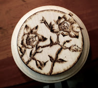
     I made a lily...it was the first thing I made and only took about 30 minutes. My choice to produce nature-related pictures on the wood is ironic. A tree was cut down and killed, which in my opinion makes the world less beautiful. However, I took that wood from a tree and recycled it into something beautiful that people can enjoy again.


 The one on the right is of little flowers from a tree branch. I started out wanting to do a snake on this piece of wood, but I didn't like the way it was turning out and had to research how to erase wood-burning. Basically, you just sand off the layer that you burnt into and start over.

     I made these two as experiments in pyrography, but I hope to get much better in the future(: There are so many amazing pictures online of portraits people have created on wood; they are so inspiring to me and I want to be able to do the same.

     Finally, Mr. Gledhill my art teacher helped me to pick out a glaze for my box mentioned in an earlier post. The glaze was basically iron rust that you mix with water and then paint onto the already fired piece. After that, you take a wet sponge and wipe off some of the glaze to give it an earthy, rustic look. I am really happy with the way it turned out and it looks especially cool with the succulent. (:


AFTER
BEFORE

Monday, May 9, 2016

Dancing Differently

Monday, May 9th

     Graffiti is absolutely an art if you do it right. I recently took interest in the subject and discovered there is a lot of captivating history behind it. This website was very informative and teaches how to draw some basic letters... check it out if you are interested!

http://www.graffitiknowhow.com/how-to-draw-graffiti-letters-for-beginners/#.VyDVvvkrLIU

     Graffiti is illegal in many places, but there are artists that have been payed big money to paint businesses who want a more urban look. This in mind, much of the graffiti art we have observed in our lives is a quick scribble of a name or an f-word, but there are some walls in certain cities dedicated to legal graffiti. It is in these places that artists can take their time and produce real works of art without the fear of being arrested.
     Banksy is a popular artist who creates murals with a deep message behind them. These are just a few of many interesting works by Banksy:
theodysseyonline.com
   
banksy environment
www.inspirationgreen.com
www.engadget.com


     I read on the earlier website that graffiti should be expressive. The letters you make should show movement and resemble a dance. You use your whole body to create this art, setting it apart from other ways of creating. Also, "due to it’s inherently illegal nature graffiti has traditionally been painted at speed, and this is why the lines and strokes in graffiti look so dynamic and fluid."

     The uniqueness and slight danger behind this art form intrigued me. I went to a nearby bridge to check out some previous designs, but sadly found a bunch of curse words, libel with first and last names as well as crude drawings. This was disappointing, but made me realize that when you make something, it should be nice enough that it would make someone feel bad if they painted over it.
     I may or may not have been inspired to spray something nicer onto that concrete wall and this photo may or may not be of some really simple art I made. Will we ever know?

     Many boats were going by that day and an old man may or may not have told me that my art looked good with a thumbs up. He might have been happy the old stuff he passed while fishing was covered. City beautification at its finest...

     The foundation of graffiti (typography) is something good to practice on paper which is completely legal (: I plan on sketching some ideas and working on a personal graffiti style in the future.

     I also plan to read the book Subway Art by Henry Chalfant and Martha Cooper once it is checked into my library.


     An optional assignment in art was to get a picture of a dancer online and then paint it. The catch was you could only use a one inch thick brush, had to be standing, and had to use every color of tempera paint provided. I made 6, but threw out 2 because they weren't very good. Here is my series of 4 dancers:


     Thank you to all those who attended our 20-Time Fair last Wednesday. I was honored to share my work with you and I'm glad you expressed interest in my work! I hope you continue to follow my blog and enjoy art. (:


Sunday, May 1, 2016

Variety

Sunday, May 1st

     This week was pretty exciting for me! In art, we are told again and again to form our own creative ideas and if we want to use a photo as a reference, we must get permission from the original creator in order to not be sued. I have never had to ask permission, but I decided to give it a shot.


ELEPHANT

      Our family's sponsor child, Mary, is about 11 years old and living in Kenya. We write letters back and forth which I love because I can get a glimpse into her life and the cultural differences between our countries. Recently, she requested of me to draw her an elephant. Pretty sweet right? Commissioned by our sponsor child ((: haha

        
Reference  photo I used taken by Laura Cook
 
     Anyways, I went online and randomly found a beautiful picture of an African elephant. I clicked further to visit the page and emailed the photographer, Laura Cook. I was not fully expecting a response, but...she enthusiastically replied with a "go ahead" and thanked me for asking her permission!


Oil Pastel Elephant 

   This photo was really amazing and I felt so honored to be able to use a professional photo to create an oil pastel for Mary. The time lapse unfortunately cut out before I was done because my phone died so I included a photo of the finished piece too.


     The reason I chose this medium is because it was one of my goals way back when we started this project to use a variety of media. Oil pastel is one I have not used a lot and I experimented with different blending and layering techniques. I planned to use the sgraffito technique on the wrinkles(layering one layer on top of another then scratching through to get details in the color of the bottom layer), but ended up liking the smoother texture which I thought gave it an eerie quality. 


SHOES

     This Christmas I received 2 pairs of white canvas shoes intended for me to paint. I hadn't had much time or many ideas considering the shoes, but 20-Time allowed me to focus on them. (: The octopus-inspired-Converse-style ones are my favorite, but I also love the cute simplicity of the cacti. 


     One issue I did have while painting these was that I got some paint on the edges and seams, but it ended up washing out alright. 5 of my friends have asked me to paint them some shoes so if you are reading this, I would be happy to create a design for you of your choice if you buy the shoes! 


SPOON JEWELRY

Spoon Rings
     I used some small collector's spoons my mom gave me and put to use a vise and pair of pliers to bend them around a wooden sizer. I originally intended to make them all into rings but made the ends of some into earrings. I was also going throw out the end that is normally used to eat with, but I made 3 of them into a bracelet! The earrings are a bit mis-matchy as one is from Florida and the other Hawaii, but that just keeps it interesting.
Spoon Bracelet

Spoon Earrings


    I surprised myself this week by getting a lot done while meeting one of my goals. The 3 types of things I created were of not-so-mainstream media (metal spoons, canvas shoes, and oil pastel). My box I mentioned in an earlier post is in the kiln and I can't wait to share my projects with you at the 20-Time Project Fair.

Tuesday, April 19, 2016

Balance

   
Tuesday, April 19th

     This week, I painted on tree bark. I have a forest in my backyard so I went back and took a piece of birch bark off a tree to use as an impromptu canvas. This is a scene from my friend's cabin in Montana:


In class we were told to focus on the IB learner profile trait of balance, defined below:


Balanced: They understand the importance of intellectual, physical and emotional balance to achieve personal well-being for themselves and others.


     This in mind, I thought about what art in my life means to me. Art is a stress reliever, especially when it turns out the way you want it to. Many people see art and use it as an escape from their busy lives and stressful work loads. However, I tend to use art not as an escape, but as an enhancement.


     When I have a night of hard homework that will take me hours to finish (thanks teachers who plan together and put all my tests on the same day... just kidding☺), I take a break by painting a quick piece or sketching in my sketchbook. Doing this helps me achieve balance emotionally and intellectually. It's amazing how refreshed I feel after and it is loads better than taking a break to check my phone.


     That is another big belief of mine and it's something I try not to do as much. When I stare at my phone for more than 20 minutes, my eyes get messed up and blurry! That's one reason I don't like using my phone a lot, but another is that it distracts from real life.

     Art can be a reflection of your feelings, emotions, what you see, or a message you want to convey. Constantly checking your phone distracts not only from real life, but you are not as closely in touch with your emotions, making it much more difficult to achieve balance in your life.


Here is a simple pen and ink watercolor I did representing literal balance:


Tuesday, April 5, 2016

"Spring" Break

Tuesday, April 5th

     Spring break came and went this past week and I created a quick watercolor and took some photos on my trip to the zoo. The Toronto Zoo had many animals and I took so many pictures that my phone died. These 3 photos are 3 of my favorites because of the way vivid colors showcase the beauty of each animal. They are also interesting to me because each one is of an animal that does not typically make a lot of noise. In this sense, the photos convey a sense of serenity and intrigue.

Eastern Smooth Green Snake, Toronto Zoo

Blue Crayfish,Toronto Zoo

Jellyfish,Toronto Zoo


     Before we actually traveled to Canada, I made a watercolor at home. I had the idea after spending a night with my sister at one of my favorite little chill coffee shops downtown. She wanted me to draw her face, but instead I drew just a quick sketch of her eye. I ended up hating it at first so I vigorously scribbled it out. The dark lines showed my anger and after taking another look, I realized I could make something from my frustration! This is the sketch I made simulating my earlier scribbled out one:


    I wanted to work with a medium I don't use often so I chose to create a more finalized piece using watercolor and calligraphy pen. I used the eye of my little sister for this watercolor because she has green eyes. When I finished the eye, I was VERY reluctant to draw permanent lines over top of it, but I decided to follow through with my idea. I'm happy I did so... take risks, people! :o


     To me, the meaning of this creation was: 

     In life there will be confusion; there will be difficult times. The beauty comes when you are able to sift through the confusion and find your inner balance. When you are able to see through the rough times, you can find yourself alongside the good in the world.